I'm walking every street in New York City.
This is the counterpoint to my walk across the US. Instead of seeing a million places for just a minute each, I'm going to spend a million minutes exploring just one place. By the time I finish walking every block of every street in all five boroughs, I'll have traveled more than 8,000 miles on foot — all within a single city. Details!
Email me at matt@imjustwalkin.com
Subscribe to my email list
Maps: Progress | Photos
Your donations allow me to keep walking full-time. If you think what I'm doing is valuable and you'd like to offer some support, I would be very grateful. On the other hand, if you think I'm a worthless bum, feel free to email me and tell me to get a job, bozo. Both are excellent options!


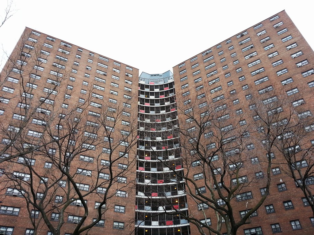
The colored metal squares remind me of Shea Stadium prior to its renovation. In both cases, as Sarah Palin would say, “you can put lipstick on a pig but it’s still a pig”.
A photo of Shea when new:
http://s84.photobucket.com/user/hendonbgb/media/sheastadium.jpg.html#/user/hendonbgb/media/sheastadium.jpg.html?&_suid=136512996502206942528387698177
Whoa — I had no idea Shea used to look that silly!
This is the building I grew up in. It was very modern when built in 1961. Swiss-born architect William Lescaze (of PSFS Building fame) designed it in the International Style. The buildings were part of a very ambitious redevelopment plan in the area (with Robert Moses at the helm) – where several developments were built based on income levels. Manhattanville Houses was the middle income complex. Manhattanville’s design was the progressive one – departing from the usual cruciform or slab design. The metal panels fronted an enclosed “terrace” room on every floor – a cool space to play, watch the views (sunsets, city life). It was great for us kids when we were too young to go out unattended. You’re right – the metal panels are reminiscent of Shea Stadium, as it was a modern design element amongst pop architecture in the 1960s. Apartments weren’t terribly spacious (except huge kitchens) but the building was solid, fireproof and with great views. The building was well located at the crossroads of Harlem, Morningside Heights and Hamilton Heights -between Columbia and City College. A very convenient place to live. Unfortunately, things declined in the late 70s/early 80s here (as in other parts of New York) and drugs and in the 90s gangs made living here untenable. While no longer the nice place it once was, the design is far more than lipstick on a pig – and deserves far better than sharing a paragraph with the likes of Sarah Palin.
My family was one of first group of residents in these projects. They were great space. We had a view of both Palisades across the Hudson river and were mesmerized by sounds of people screaming on the roller coaster at the Palisades amusement park . To the east we could play downstairs in the playgroup and our mother could look out the window and keep an eye on us. The Y wide design of the property allowed for sweeping walkways to the entrance of the buildings. In the middle of Y was a rolling green space where our mother planted a garden. there were also 100 full grown trees planted when it opened. The panels echoed the block designs of Piet Mondrian which were popular at that time.
Having lived in NY all my life i haven’t seen any other project since then to match this.
In a few years I’m sure it will be converted into Columbia University Housing to go with their massive project in work across Broadway.
I also moved here with my family after the buildings were finished. I spent the first 7 years of my life there. I remember going to play in the green space every morning. The kids would play together and the moms would sit and talk. My family was Greek. My friends were Black, Puerto Rican, Asian, Irish, Italian. I will never forget the Y shaped buildings or the bright primary colored squares on the balconies where we kept our tricycles. I attended PS 161 across the street.