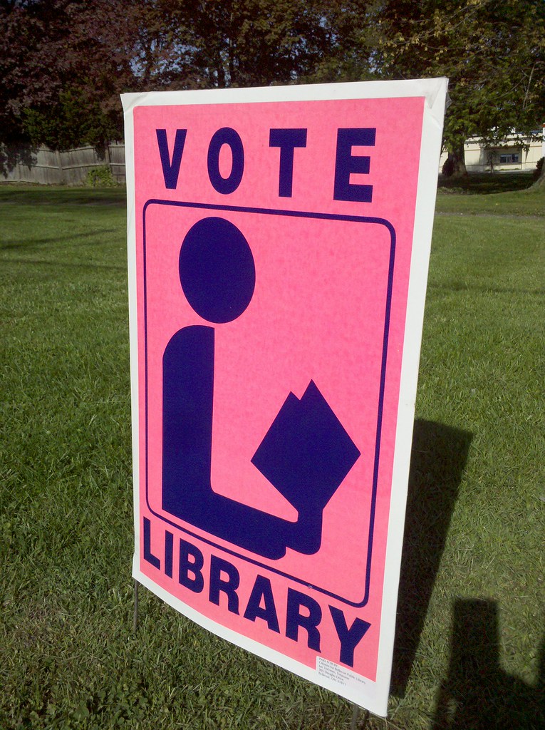
Yeah, it’s definitely weird. The “L” shape is a little forced; it makes the reader look a little hunchbacked. One gets the sense the American Library Association wasn’t thrilled about the symbol either:
“So much time and energy has already gone into the library symbol … if we’re going to get the symbol launched and accepted, we have to make it look as good as possible.”
After the ALA adopted the symbol in 1982, the Federal Highway Administration adopted it for roadway signage in 1985.
That's the idea, at least. I'm walking westward from New York City for nine months or so.
If everything goes according to plan, I'll be in Oregon when the clock runs out.
If nothing goes according to plan, maybe I'll end up in Peru or Mongolia or Pennsylvania.
You can read all about the details of my trip
if you're so inclined.

Yeah, it’s definitely weird. The “L” shape is a little forced; it makes the reader look a little hunchbacked. One gets the sense the American Library Association wasn’t thrilled about the symbol either:
“So much time and energy has already gone into the library symbol … if we’re going to get the symbol launched and accepted, we have to make it look as good as possible.”
After the ALA adopted the symbol in 1982, the Federal Highway Administration adopted it for roadway signage in 1985.
(source)
INTERNET RESEARCH WOO!
In all these years I never noticed it was supposed to look like an L!
I will never vote for Library. Not after last time.
Looks like someone doing yoga holding book with feet.
Yes, that’s a stange pic.